
A simplified and more accessible solution for senior users of Spotify App’s Interface
UX Researcher | UX-UI Designer
Figma | Adobe CC | Wooclap


The objective is to demonstrate how the digital accessibility barrier can be eliminated, to overcome the effects of standardization and design-for-all solutions of the most popular apps.


Goals
Provide an automatic switch of interface within the app itself. Therefore, remove the necessity of a younger third party to act as the configurator of the senior mode. Go beyond the simple assistive technology and create an enhanced experience for the senior user.
Detected Facts
There are some assistive technologies that respond and adapt to the change of context. For example the brightness of screens when there’s too much sun, or the volume of operative systems when using headphones for too long at high rates.
Proposed Solution
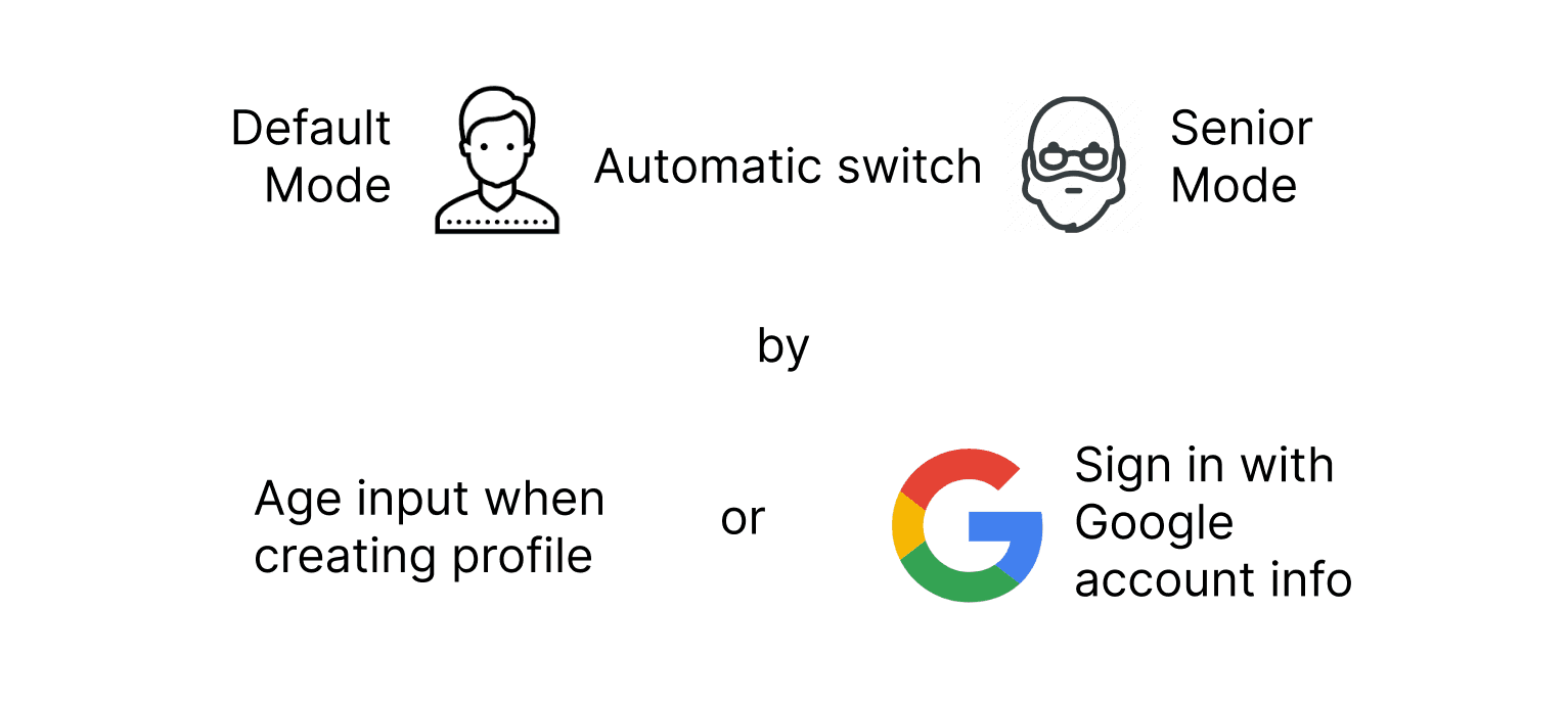
Using the age of the senior user itself as the provided context. Whenever the user is creating a new profile and has to input their age or signs with its google account, if the range falls between 60 or more, the interface changes automatically to a senior-mode.


Setting main actions

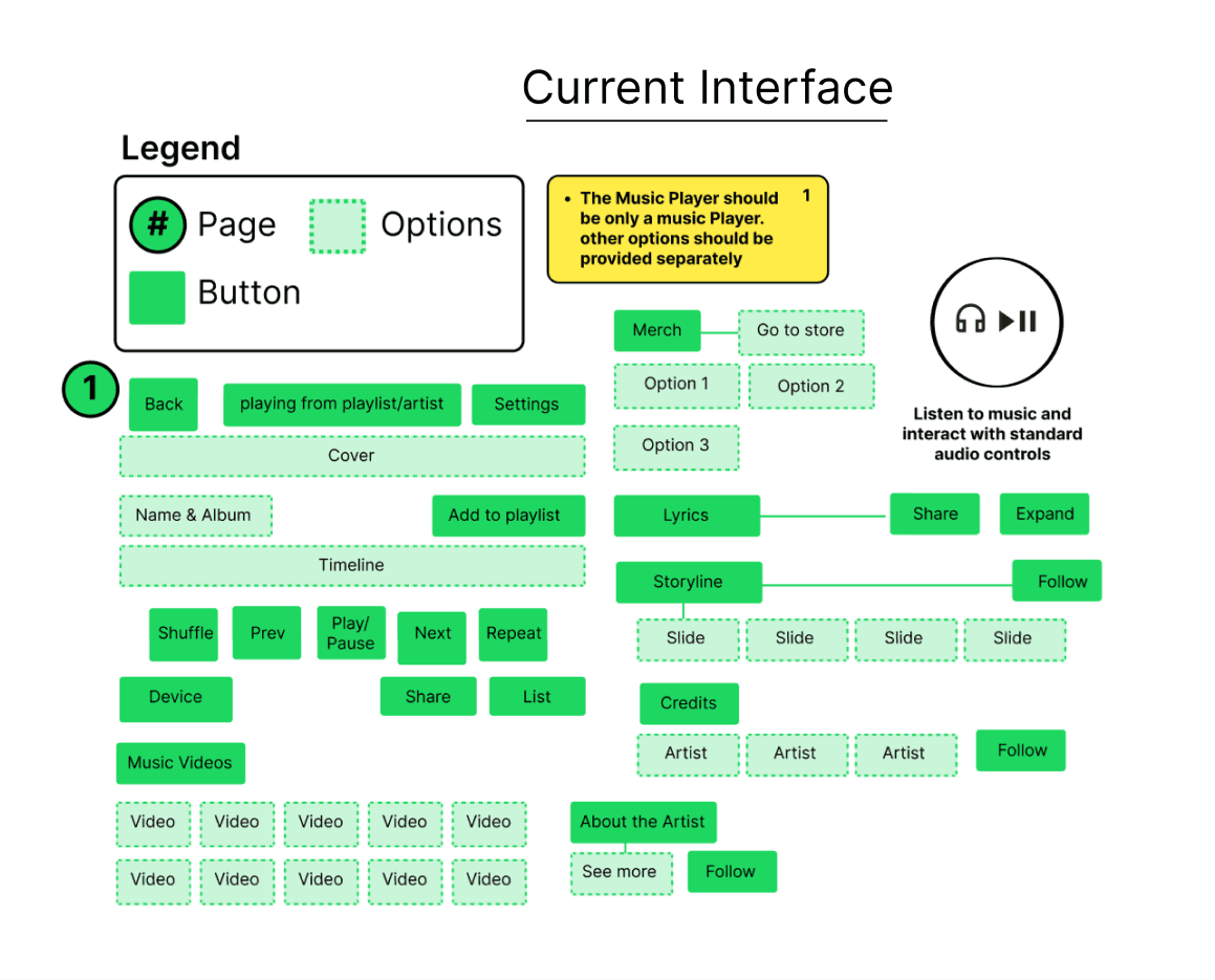
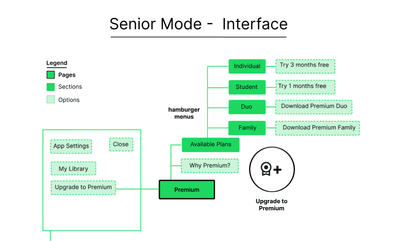
The current information architecture of the Spotify’s App was simplified in a more clean and understandable version. Including of course, the hidden and automatic switch for the senior mode and based on the before mentioned main actions.





Wireframes
These are the wireframes of the new Spotify senior mode interface.They are a low fidelity version of the redesign that helps to understand the composition of the elements within every page.

UI Components
These are the components that were used for the re-design of the Spotify App’s interface. Mainly the use of typography, colors and icons, which are all elements that together shape in a more coherent and simple way the senior mode interface. Boosting the graphical coherence and navigation through the screens.


High-Fidelity Key Screens
The different screens of the new interface show how some aspects were improved in terms of navigation, content organization and graphic coherence. Therefore facilitating the accessibility for senior users, without providing a rustic ABC senior mode which is normally the common approach.


Prototype
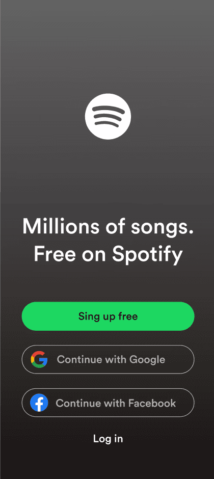
All the components were designed using Figma and were put together in a high fidelity prototype. The maximized and minimized versions of the player, were put on another layer and duplicated through all the pages. Allowing a simultaneous navigation while listening, but in a more coherent and simplified way.


Challenges
Creating an attractive usability questionnaire and run it with a substantial amount of users.
Test the prototype and iterate it in a short amount of time with real users
Making functional the dual navigation of the prototype with separate layers of interaction
What I learned
There’s no need to create a whole new app for senior users, whereas rethink the the interface of the existing ones.
The senior user market is not being exploited and doing so will be a win-win situation for both the user and the service provider.